Business Intelligence

I’ve worked extensively on Business Intelligence projects, transforming raw data into actionable insights. If you’re looking to leverage data-driven strategies to take your business to the next level, feel free to get in touch!
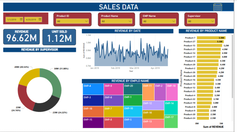
Sales Data Dashboard
This dashboard provides an overview of sales data and is designed to give insights into revenue performance and key metrics:
Filters:
Date range, Product ID, Product Name, Employee (EMP) Name, and Supervisor filters allow for dynamic customization of the data displayed.
Key Metrics:
Revenue: Displays total revenue ($96.62M).
Units Sold: Displays total units sold (1.12M).
Visualizations:
Revenue by Supervisor: A pie chart showing revenue distribution by supervisor with percentage contributions.
Revenue by Date: A line chart showing the revenue trend over time, allowing analysis of performance changes across months.
Revenue by Product Name: A bar chart ranking products by revenue.
Revenue by Employee Name: A grid visual illustrating revenue contributions by individual employees, using color-coded tiles for easier distinction.
To see Full dashboard
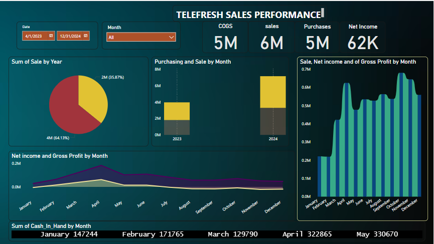
Telefresh Sales Performance
Key Metrics
Sales: 6M
Purchases: 5M
Net Income: 62K
COGS (Cost of Goods Sold): 5M
Yearly Sales Breakdown
Displays sales distribution for 2023 and 2024, with 2024 contributing 64.13% of total sales.
Monthly Trends
Visualizes purchasing and sales performance across months for both years.
Profitability Analysis
Highlights trends for sales, net income, and gross profit month by month.
To See Full Dashboard
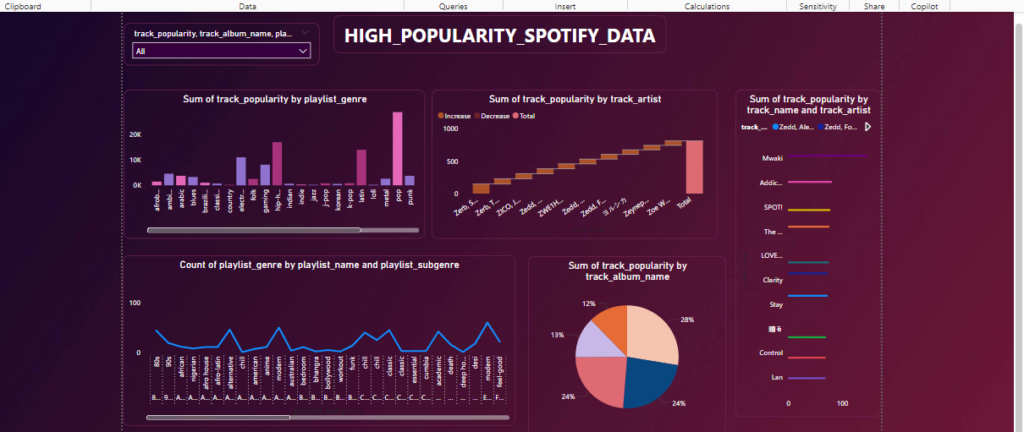
Spotify Popular Tracks Dashboard
Our interactive Spotify Popular Tracks dashboard offers a comprehensive view of popular music trends. It is designed to provide actionable insights into Spotify’s data by visualizing key metrics, such as:
Popular Tracks by Playlist Genre and Artist: Understand track popularity across genres and explore the artists that dominate each category.
Tracks by Name and Artist: Analyze individual track performance and their respective artists.
Playlist Genre Distribution: View the count of playlist genres categorized by playlist names for better segmentation.
Sum of Track Popularity by Album: Dive deep into album performance with a detailed summary of track popularity.
Playlist-Level Popularity Insights: Utilize a dynamic donut graph to view the sum of track popularity by playlist name, enhanced with a tooltip page for additional context.
To See Full Dashboard
Brazilian E-commerce Dataset by Olist Dashboard
This interactive dashboard offers a detailed analysis of the Brazilian e-commerce market using the Olist dataset. Designed to provide insights into customer behavior, product trends, and sales performance, it features the following key visualizations:
Payment Value by Customer State: Analyze the total payment value across various Brazilian states, highlighting regional sales distribution and performance.
Customer Count by Year: Visualize customer growth trends over the years, with a detailed breakdown of customer states.
Product Categories by Year: Explore the distribution of product categories sold each year, presented through a clear and engaging pie chart.
Product Name Length by Category: Examine product naming conventions by category, showcasing trends in product description lengths.
Order Status by Year: Track order statuses (approved, pending, etc.) annually with an intuitive donut chart, revealing patterns in order fulfillment.

To See Full Dashboard
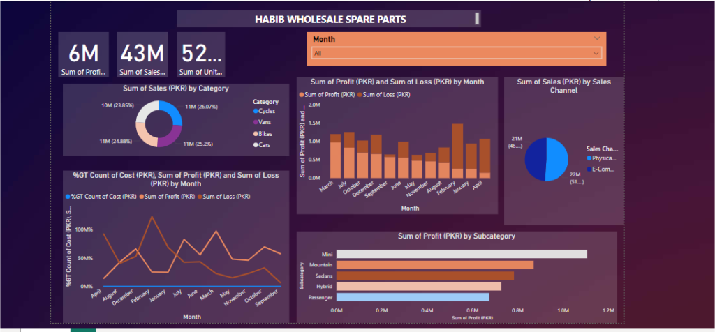
Habib Wholesale Spare Parts Dashboard
This dashboard provides key insights into sales, profit, and loss trends for Habib Wholesale Spare Parts. It features:
KPIs: Total profit, sales, and units sold.
Sales by Category: Breakdown of sales across product categories like Cycles, Vans, Bikes, and Cars.
Profit and Loss Trends: Monthly analysis of profit and loss patterns.
Sales Channels: Comparison between physical and e-commerce sales.
Profit by Subcategory: Highlights the most profitable subcategories (e.g., Mini, Sedans, Hybrid)
To See Full Dashboard
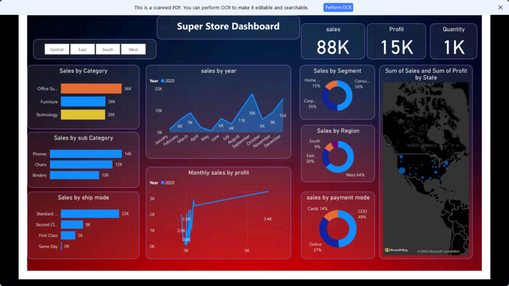
Super Store Dashboard
This Super Store Dashboard provides a detailed overview of key business metrics and performance insights. It is designed for efficient monitoring of sales, profit, and product trends. Key features include:
KPIs: Display of total sales (88K), profit (15K), and quantity sold (1K) for a high-level summary.
Sales by Category and Subcategory: A breakdown of sales across main categories (Office Supplies, Furniture, Technology) and subcategories (Phones, Chairs, Binders) to identify high-performing products.
Sales Trends by Year: A line graph showing monthly sales trends to analyze seasonality and performance throughout the year.
Sales by Ship Mode: Comparison of sales based on shipping modes (Standard, Second Class, First Class, Same Day) to evaluate customer preferences.
Monthly Sales vs. Profit: Visualization of profit trends alongside monthly sales, providing insights into profitability patterns.
Sales by Segment and Region: Pie charts to understand customer segments (Consumer, Corporate, Home) and regional sales contributions (South, East, West).
Sales by Payment Mode: Breakdown of sales via payment modes like Cards, Cash on Delivery (COD), and Online transactions.
Geographic Sales Performance: A map displaying the sum of sales and profit by state for spatial analysis.
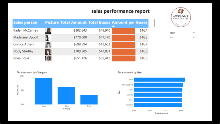
Awesome Chocolates Sales Dashboard
This dashboard analyzes sales performance across teams, regions, and categories, highlighting key insights:
Sales Performance: Individual salesperson metrics, total sales, and amount per box.
Category & Geography: Total sales by product categories (Bars, Bites) and regional contributions (India, USA, UK).
Team Performance: Contributions by sales teams (e.g., Yummies, Delish).
Trends & Forecasts: Yearly and monthly sales trends with future predictions.